
TypeScript has never been easier thanks to the TypeScript plugin for Babel. Discover 4 reasons why TypeScript + Babel are a perfect pair, and follow a step-by-step guide to upgrade to TypeScript in 10 minutes.
The Best Open Graph Image Size (Stolen From Top Websites of 2018)
Last updated:
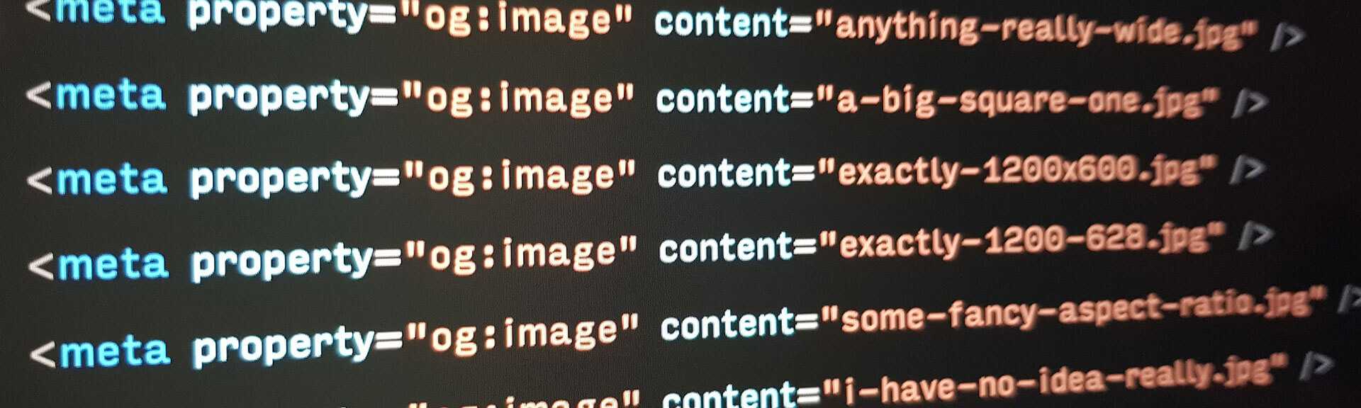
Everyone wants a piece of your sweet sweet Open Graph image. I’m talkin’ about Facebook, Twitter, Pinterest, LinkedIn, Google+, Slack, Yammer, Facebook Messenger, WhatsApp, Reddit, The Official Hello Kitty Fan Fiction Forum, the list goes on.
They’re each gonna take your og:image and resize it, crop it, and slap it around until it’s snug within the Facebook feed, Twitter timeline, or your Dad’s email newsletter about potatoes. Some like it big and wide, and some like it small and square-ish. No judgement here.
But you can only set one single Open Graph image. So how do you cater for all these platforms? What image size and aspect ratio is best?
Let’s Google it!
According to the first page of Google:
- Facebook Open Graph Docs suggests 1200 x 630 (1.9:1)
- Twitter Docs suggests 2:1 for large images, and 1:1 for small images
- Buffer suggests 1024 x 512 (2:1)
- H3xed suggests 1200 x 1200 (1:1)
No general consensus. So…
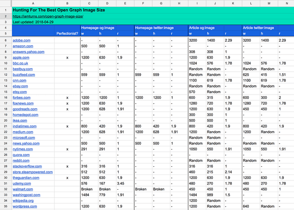
I analysed how 30 massively popular websites use og:image
I chose websites that are a) very popular, b) have pages begging to be shared, and c) tickle me.
Here’s who made the cut: adobe.com, amazon.com, answers.yahoo.com, apple.com, bbc.co.uk, bestbuy.com, buzzfeed.com, cnn.com, ebay.com, etsy.com, forbes.com, foxnews.com, goodreads.com, homedepot.com, ikea.com, indiatimes.com, medium.com, microsoft.com, news.yahoo.com, nytimes.com, quora.com, reddit.com, stackoverflow.com, store.steampowered.com, theguardian.com, udemy.com, walmart.com, washingpost.com, wikipedia.org, wordpress.com.
The results
Just want the recommendations? Jump straight to the cheatsheet.
On the homepage:
- 57% of websites use og:image
- Image width ranges from 291 to 1484 (average: 871)
- Image height ranges from 167 to 1200 (average: 564)
- 53% with og:image set a landscape image
- 56% set a ratio of 1.9:1 (80% exactly 1200 x 630)
- 41% set a width of exactly 1200
- 41% with og:image set a square image
- With average dimension of 554 x 554
- 43% of websites do not use og:image
- Udemy sets a 576 x 167 image (ratio of 3.45:1, wtf?)
- Walmart sets a broken image (ouch)
On article & product pages:
- 93% of websites use og:image
- Image width ranges from 316 to 3200 (average: 960)
- Image height ranges from 215 to 1400 (average: 547)
- 64% with og:image set exact dimensions
- 72% set a landscape image
- 50% set a width of 1000 or more
- 36% with og:image change image dimensions from page to page
- 7% of websites (Quora and Amazon) do not use og:image
- Quora is text heavy, and they possibly want more space for the text.
- Amazon surprises me, but they don’t seem to care much for visuals in general.
Searching for a pattern
No strong pattern emerged from the above results. But, if we ignore websites that set random sizes, wacky aspect ratios, and broken images: 8 websites remain standing.
I call them… the perfectionists!
👏 for apple.com, forbes.com, foxnews.com, goodreads.com, indiatimes.com, nytimes.com, stackoverflow.com, theguardian.com.
These guys know what’s up.
What do the perfectionists do?
On the homepage: 50% set a ratio of 1.9:1, with 75% set exactly 1200 x 630
On article & product pages: 63% set a ratio of 1.9:1, with 60% set exactly 1200 x 630
What about twitter:image?
Twitter allows you to override og:image with a different image by setting the twitter:image meta tag. If twitter:image doesn’t exist, it will use og:image.
How do these 30 websites use twitter:image?
Pretty badly. Most set twitter:image to be the same as og:image, which doesn’t achieve anything.
Only 4 websites use twitter:image as intended:
- Buzzfeed: og:image = random sizes, twitter:image = 625 x 415 (1.5:1)
- Forbes: og:image = 600 x 315 (1.9:1), twitter:image = 600 x 300 (2:1)
- Goodreads: og:image = 1200 x 630 (1.9:1), twitter:image = 450 x 450 (1:1)
- Wordpress: og:image = 1200 width x random height, twitter:image = 640 width x random height
The way Buzzfeed and Wordpress use twitter:image makes no sense to me. Perhaps developers updated og:image but forgot about twitter:image, and they became out of sync.
Forbes and Goodreads seem to have a specific strategy here, following advice directly from the Twitter documentation.
Summary & Cheatsheet
What size og:image for my homepage?
Don’t bother setting one.
But if you do…
- Want a landscape image? 1200 x 630 (1.9:1)
- Want a square image? 1200 x 1200
For perfectionists: Set a landscape image at 1200 x 630 (1.9:1).
What size og:image for my article & product pages?
- Landscape image
- Width between 1000 and 3200 pixels
- Any height
For perfectionists: Set a landscape image at 1200 x 630 (1.9:1)
Should I use twitter:image?
No, don’t bother.
For perfectionists:
- Want a landscape image?
- Follow the Twitter docs: Summary with large image
- 2:1 aspect ratio (eg: 1200 x 600 pixels)
- Minimum dimensions: 300 x 157
- Maximum dimensions: 4096 x 4096
- Want a square image?
- Follow the Twitter docs: Summary card
- 1:1 aspect ratio (eg: 600 x 600 pixels)
- Minimum dimensions: 144 x 144
- Maximum dimensions: 4096 x 4096
Reverse engineering successful websites can reveal interesting insights
Here’s some ideas I plan to research soon:
- What’s the most popular keywords on the frontpage of Reddit? Has it changed over time?
- What’s the average amount of comments on a Hacker News thread? Which threads attract the most?
- What’s the most common body text font size? Does it change across breakpoints?
- Which Instagram hashtags are used by the most popular accounts?
If this kinda stuff tickles you, subscribe below and I’ll send you an email when I write an article:
I know, emails suck. I promise to send only quality stuff. And if not, just unsubscribe!
Bonus: Raw Data
If you find any extra patterns or anything I’ve missed, please let me know!

Simplify your dev tools — it‘s time to give npm another chance.
Introducing: Joe, the stereotypical developer in 2018. Inspired by the 100,000 devs who participated in the 2018 Stack Overflow Developer Survey.

I dreaded returning to programming during a recent holiday. It turns out I’m just done with Angular. Is it useful in 2018?
RxJS automatically kills streams when errors occur. This is hard coded. The solution: use disposable streams.
It’s impossible to keep up with JavaScript.
You’re catching up every chance you get. Scrolling… reading… refreshing… skimming. You’re lost in 42 browser tabs of articles, tutorials, and GitHub repos. You bookmark a handful to check out later (or, never).
It’s overwhelming. There’s too much to know.
So I developed a system that easily keeps me up-to-date.